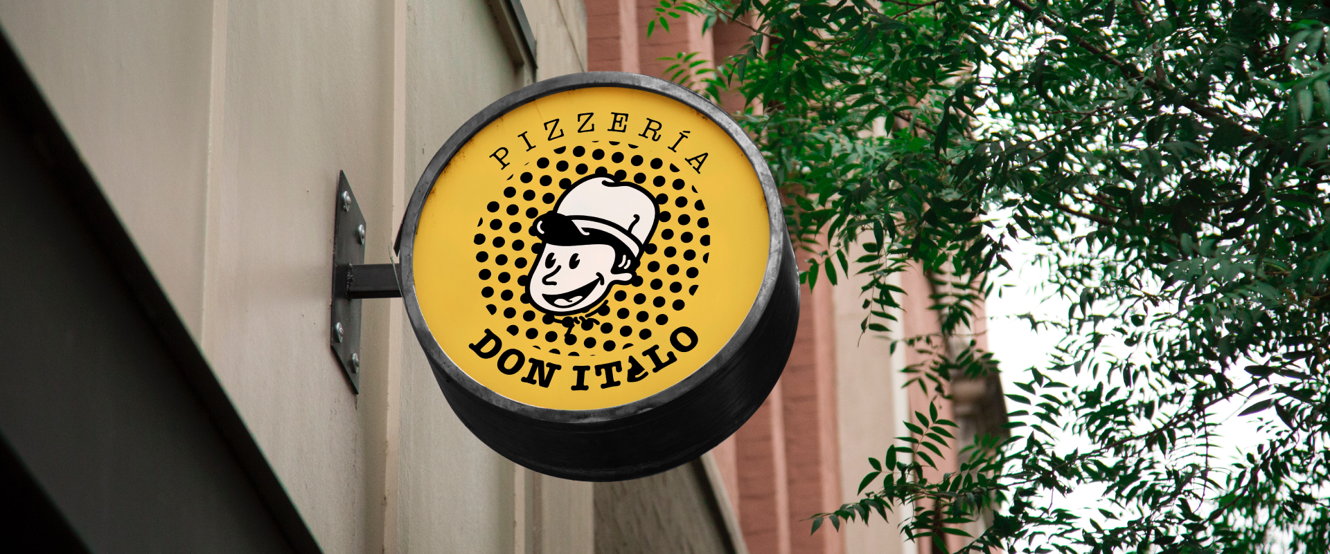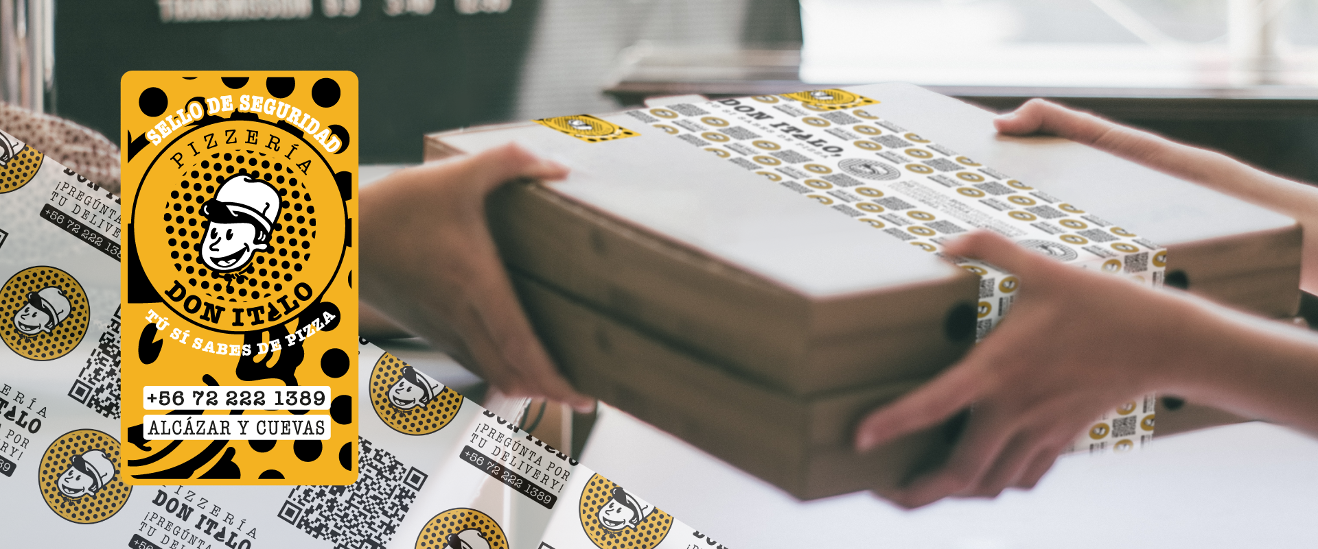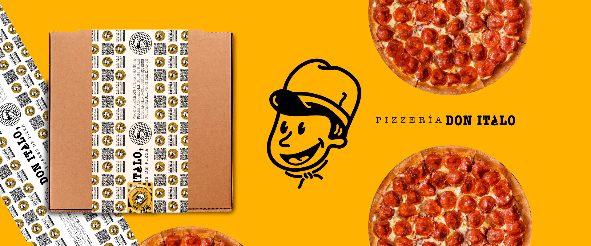
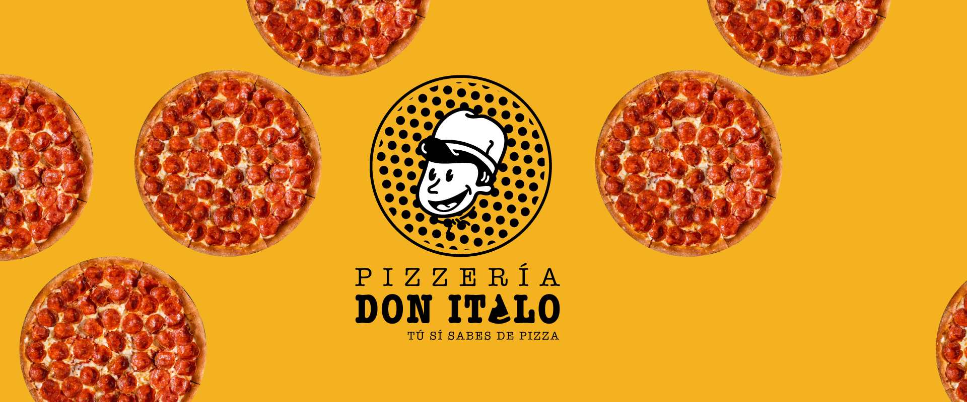
CASE: When Don Ítalo started his business, the brand was meant to personaficate a some experienced italian Don Ítalo, and communicate the idea of pizza place, pasta (trattoría) and coffee. With the years, the business has established only as pizza place, New York Style giant pizzas with a lot of great flavors on his "top 10". According to their social media, the owner simpathy is a great value that people commented a lot, so I needed to rescue that asset and give it a fresh redesign that would intesify the feeling, and keep the idea of delicious pizza well made. Don Ítalo is a place where people can enjoy a pleaseant family and friends moments, eating a very unique delicious pizza, share the experience of a giant pizza with too many ingredients to not get excited, and drink great homemade jucies.

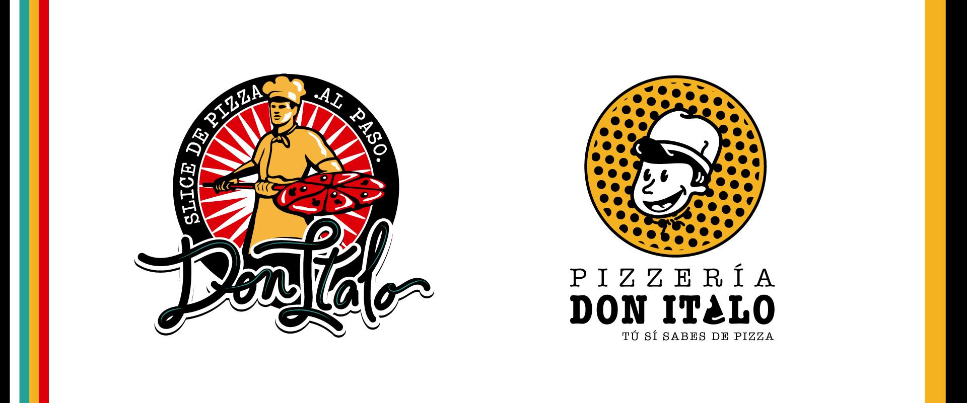

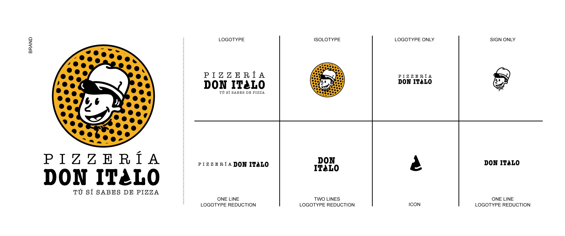
One of my design goals was to make a cheaper-to-produce-logo, according to the real final uses, and the real available budget. At a communication level I wanted a design that give the feeling of quality enjoyable pizza from the hands of Don Ítalo. Simpathy, fun, likeable, desirable.
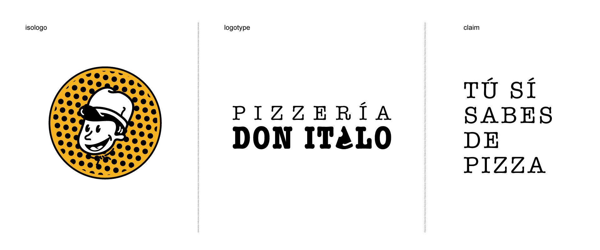
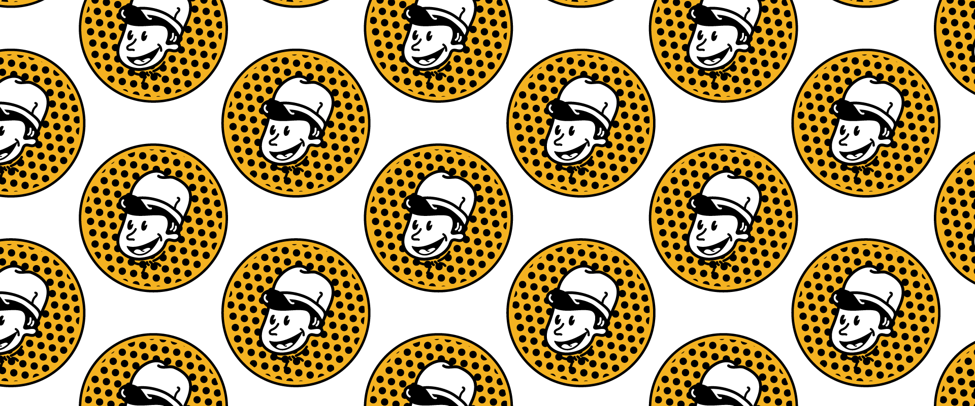
I rescued one color from the old brand, the cheese color, which is the ingredient that makes pizza a pizza, no matter what comes after. I also wanted to ad pepperoni as secondary code, beacause it's the most selled pizza anywhere.